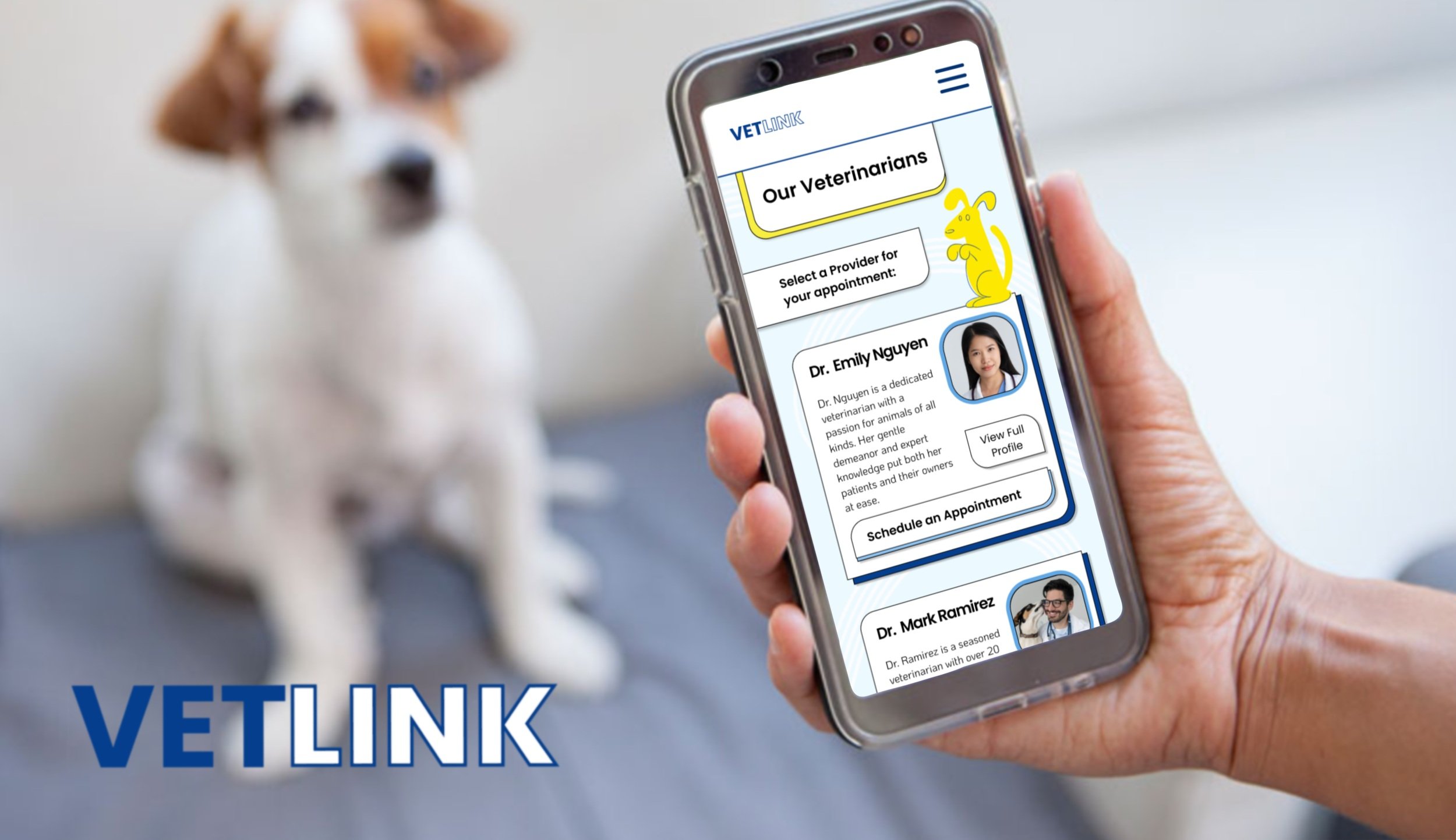
VetLink:
Expert virtual vet care - with a personal touch
Expert virtual veterinary care - with a personal touch that’ll make your tail wag!
The Problem:
Pet owners experience high levels of stress and inconvenience when visiting traditional veterinary clinics. Additionally, pet owners voiced a lack of personal connection and empathetic care from veterinary staff.
The Solution:
There is a need for a virtual veterinary app that provides a more convenient and emotionally supportive experience, while still offering expert medical care for pets.
Tools Used:
Figma
Miro
Adobe Illustrator
Adobe Photoshop
Trello
Slack
Zoom
Google Drive
Google Forms
My roles & responsibilities:SCRUM Master, concept art, lofi prototype, story board, user interviews & research, data analysis, competitor research, documentation creation and editing
Who is The YMCA?
"The YMCA is the leading nonprofit committed to strengthening community by empowering young people, improving the health and well-being of people of all ages and inspiring action in and across communities." sourceCurrent Desktop Site:
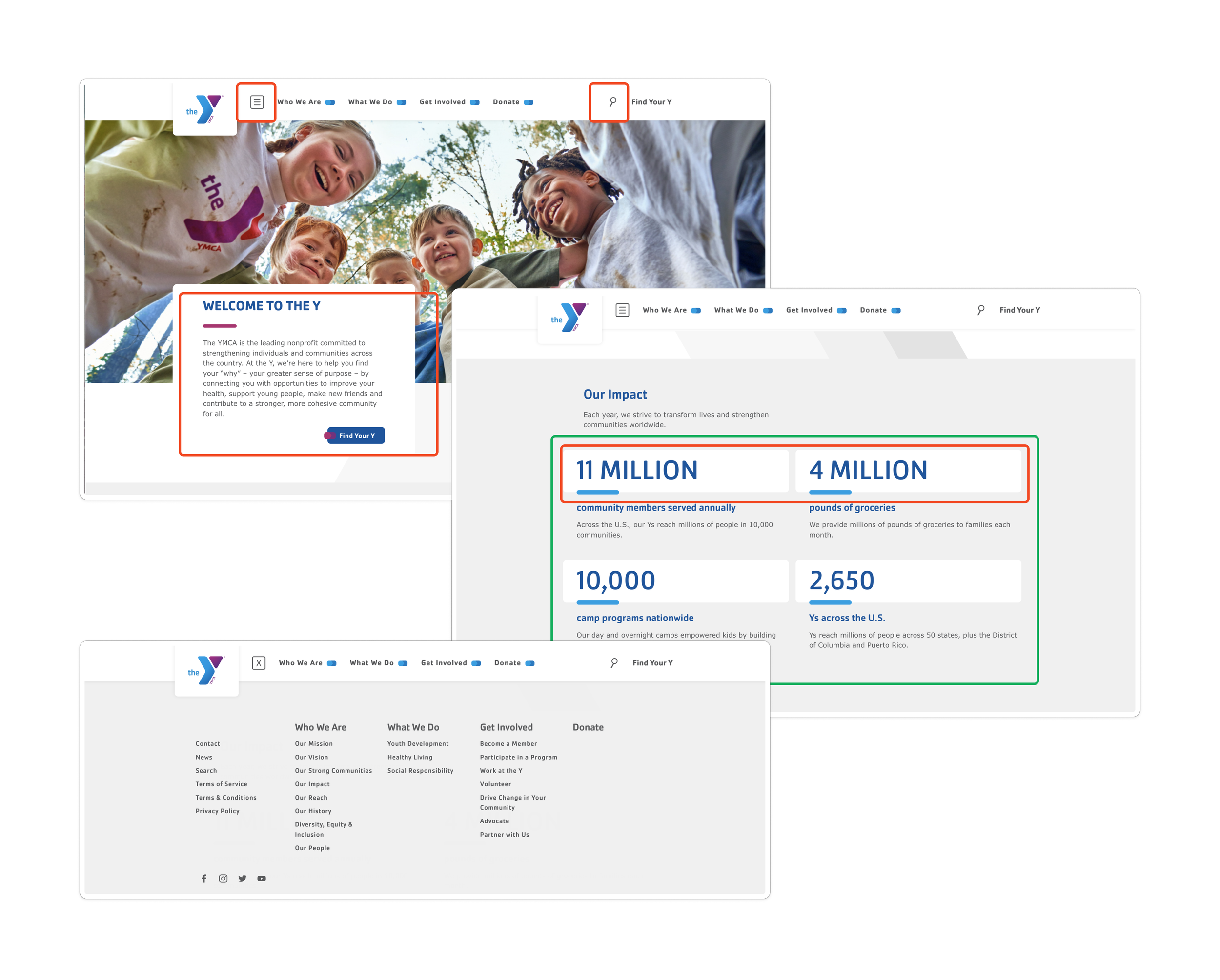
Overall, the original website isn’t too bad off. It contains a lot of useful and pertinent information for users and browsers of the site.
But it is lacking in UI: neglecting color contrasts, redundancies in the navigation and menus, and an overly vague menu that could leave a first time user lost.
Problem Statement:
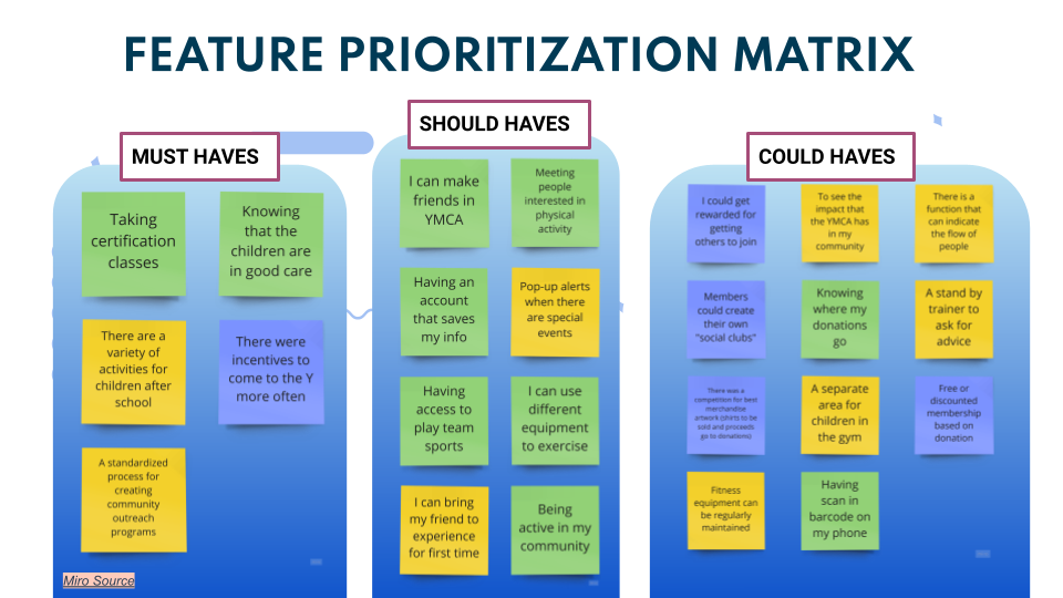
We have observed that people are not fully aware of the variety of amenities available to them, which may impact their decisions to become members. How might we increase awareness to help with memberships and donations?
Initial
Survey
Results:
We conducted a field survey with the public to get a better understanding of how the Y is perceived. Shockingly, even though over 87% of our participants knew of the Y, only 25% of those surveyed are members. (source)Is there a YMCA in your community?
Are you a member of your local YMCA?
Meet Deb,our proto-persona:
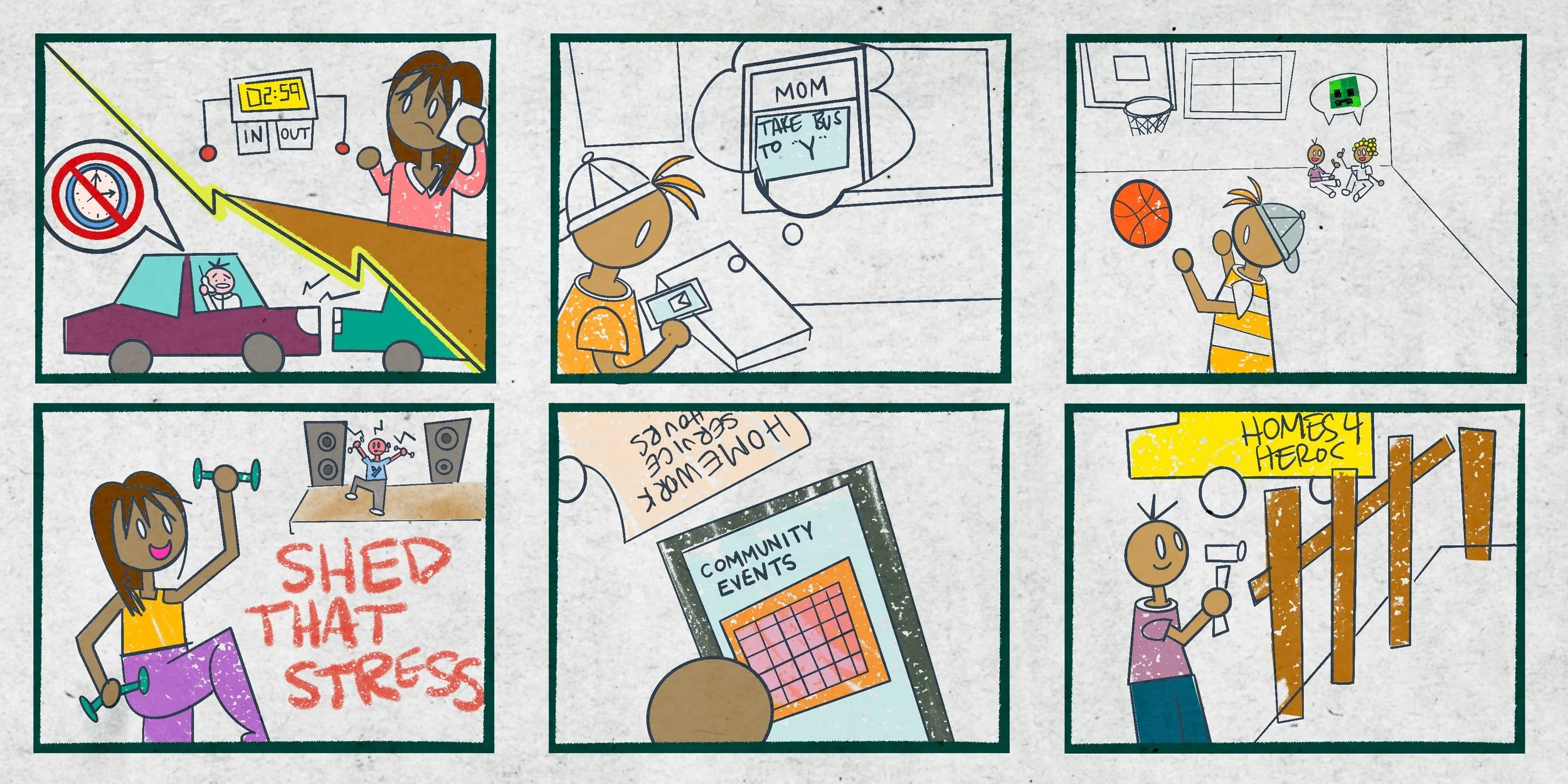
Deb is a working mom who is trying to balance her inconsistent work schedule with her kids’ school and extra curricular schedules - all while working towards a more positive and productive lifestyle.
Storyboard:
From being stuck at work to completing social and homework assignments - the YMCA is there for Deb every step of the way.
UX Hypothesis:
We believe that by redesigning the YMCA site we will not only increase the public's knowledge of what we have to offer, but will also increase membership numbers, donations, and community involvement.
Value
Proposition:
YMCA is more than just a facility, it is an actual and integral part of the community. The YMCA is developing new and improved ways to increase member participation, provide enriching activities and increase community focused donations.
With trust built through transparency and strong relationships, the YMCA proves time and time again to be an integral part of the community.
Competitor
Audit:
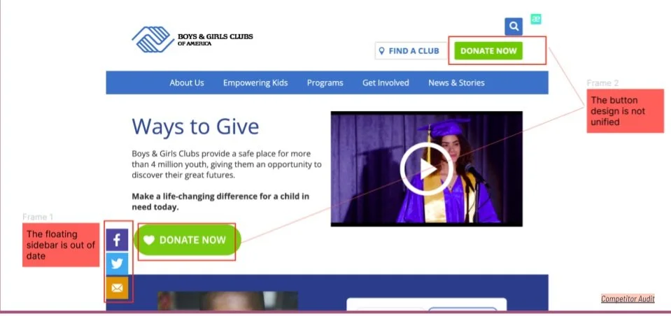
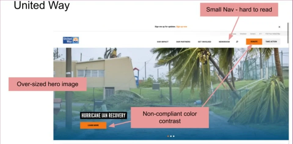
Our competitor audit consisted of 3 direct and 2 indirect competitors. During this research we noticed that most of the sites had the same idea for design, but had poor execution: non-compliant contrast colors, inconsistent design, and dated feeling pages.
Starting the Rebuild:
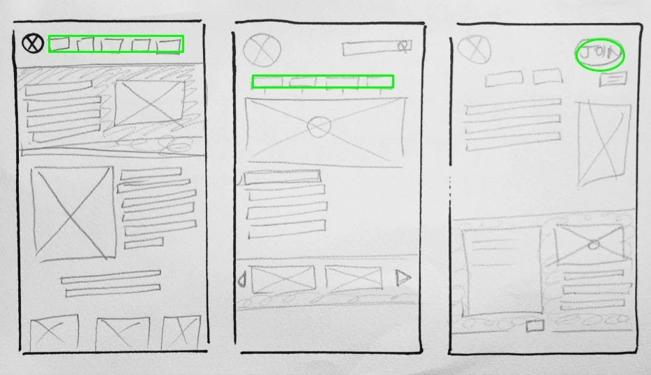
With user research, testing and a goal in hand, we were able to start forming the bones of the rebuild. Showcasing and focusing on donations and community involvement were key.The YMCA’s site needed a stronger focus on the donation contribution and community involvement aspects, so the team went to work with reiterating multiple different designs for the rebuild. Here, we get to see three different reiterations. Figma SourceLoFi Prototypes:


LoFi Building & User Testing:
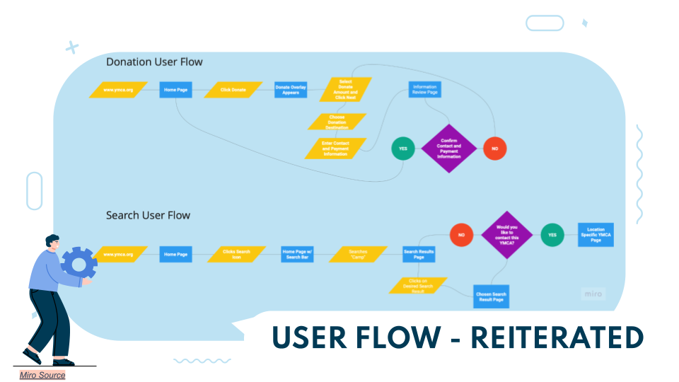
Our user testing showed that, without question, the reiterated version of the search function and donation feature were easily navigable and intuitive.User Accessing Search Function:
User Accessing Donation Function:
By making the donation function intuitive, personable and direct - users are able to navigate and complete this feature with ease!
HiFi Prototype with Style Guide:
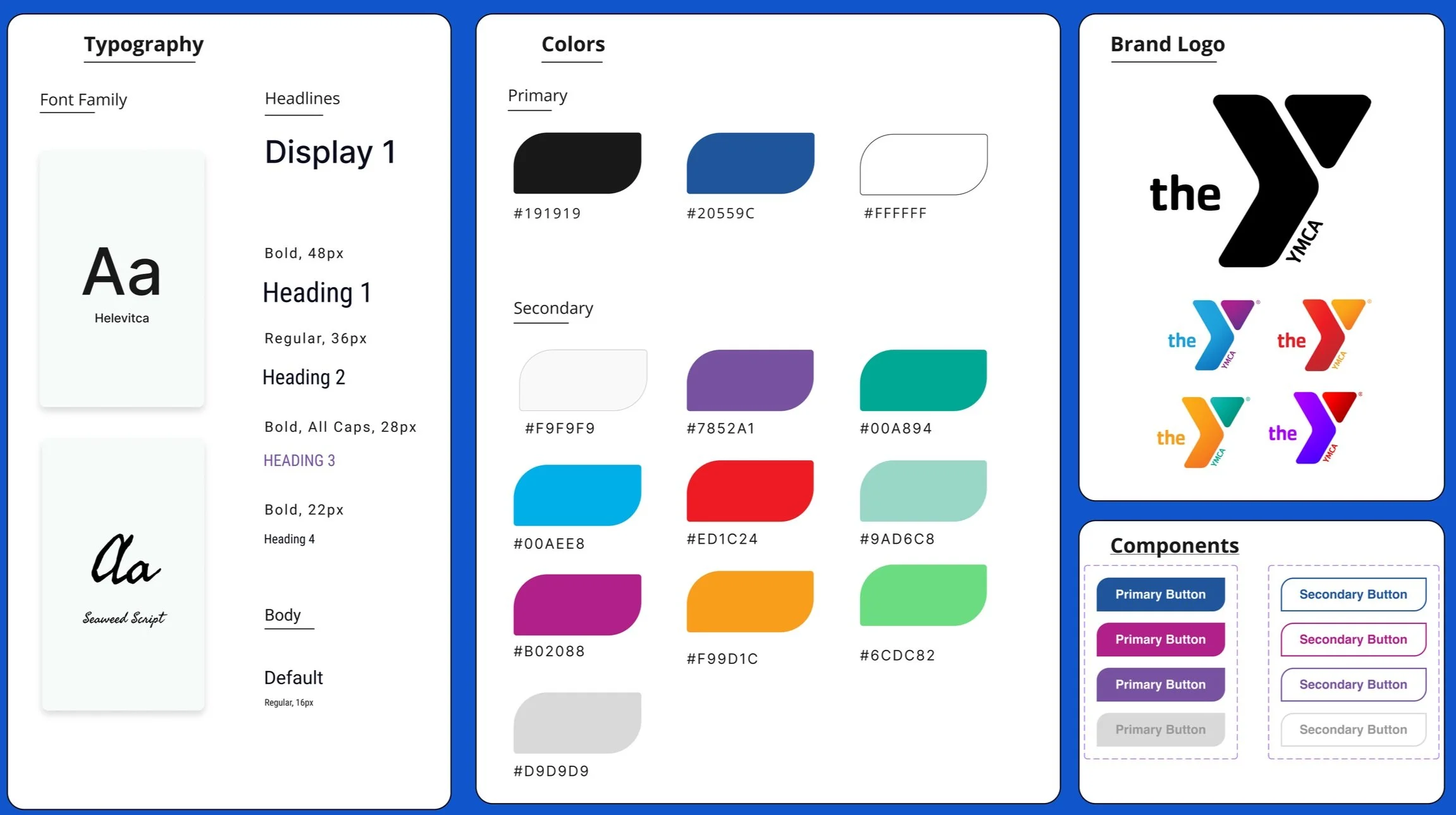
Cementing the style guide to ensure design consistency was another crucial and well executed step in the process. Now, no matter who works on the site, styling will not be a concern.Using certain elements that the YMCA already uses while bringing in a color refresh and more playful UI, users, new and returning will know they are in the right place and experience a lighter overtone.Future Features & Final Thoughts:
With extended time and resources, we would hope to develop further features as:
Employees could vote for "Member of the Month" and give perks
Local businesses and YMCA chapters could join for “community outreach” days
A free membership donated for every membership purchased
Incentives (not financial) for frequent volunteer work
Final Thoughts:
This project was very uplifting and invigorating from the start. Having worked with a team where each others’ strengths complimented each other along the way, I couldn’t have asked for a better team.
The YMCA does so much more for the community than most people are aware of. And they continue to do the work to make sure that everyone has good experiences. Doing good for the greater good.
