
The FCC: A Responsive Redesign
A total design & navigation overhaul to improve the User Interface.
The Problem:
With an outdated and varying in design, the current FCC site provides little assistance to users who access the site. Users are left to guess the site’s navigation while leads to frustration and confusion.
The Solution:
Update the site with a completely new design with the user interface and navigation as top priority. Utilize the current databases while also focusing on the reorganization of the navigation so that users can experience a site visits with ease.
Tools Used:
Figma
Miro
Adobe Illustrator
Trello
Procreate
Slack
Google Drive
My roles & responsibilities:
Project manager, user interviews & research, wire framing, storyboard, competitor research, prototype (lofi & hifi), style tile, UX designer
Who is The FCC?
"The Federal Communications Commission regulates interstate and international communications by radio, television, wire, satellite, and cable in all 50 states, the District of Columbia and U.S. territories. An independent U.S. government agency overseen by Congress, the Commission is the federal agency responsible for implementing and enforcing America’s communications law and regulations." source
Current Desktop Site:
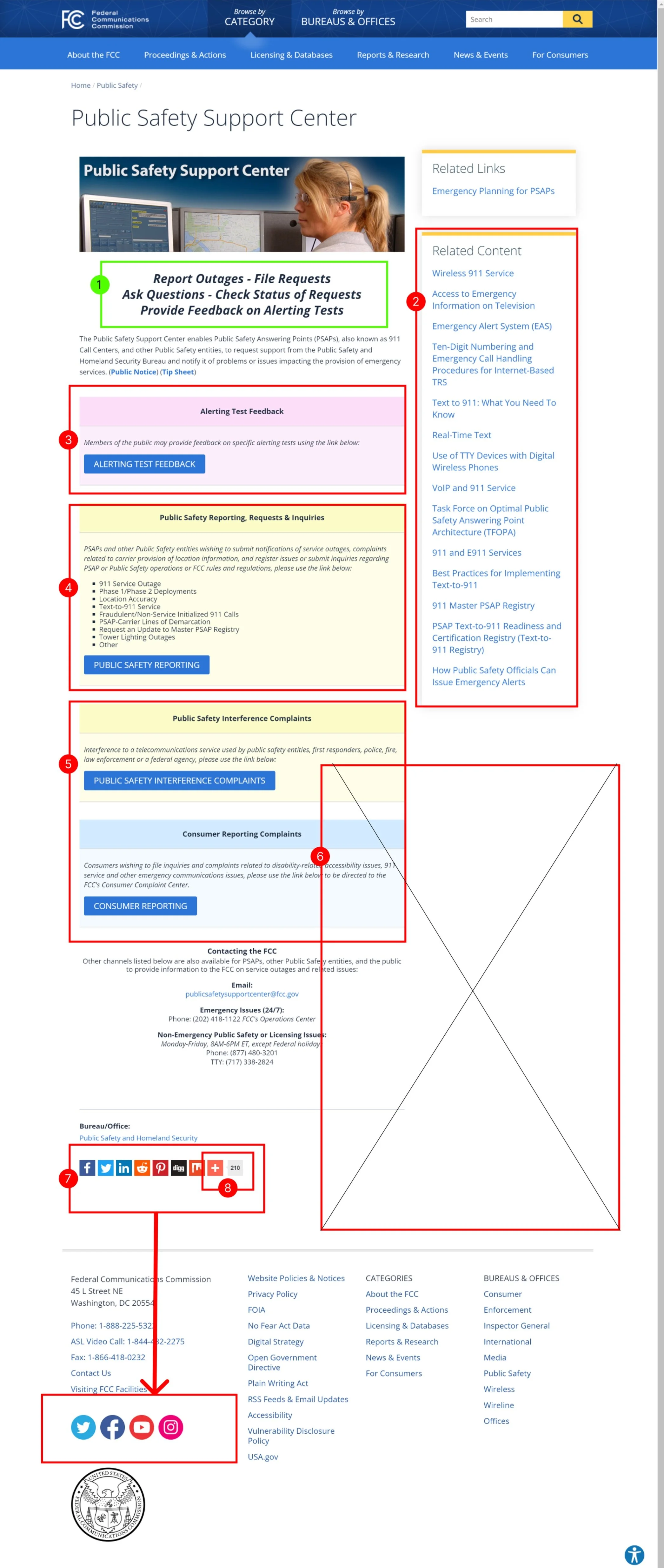
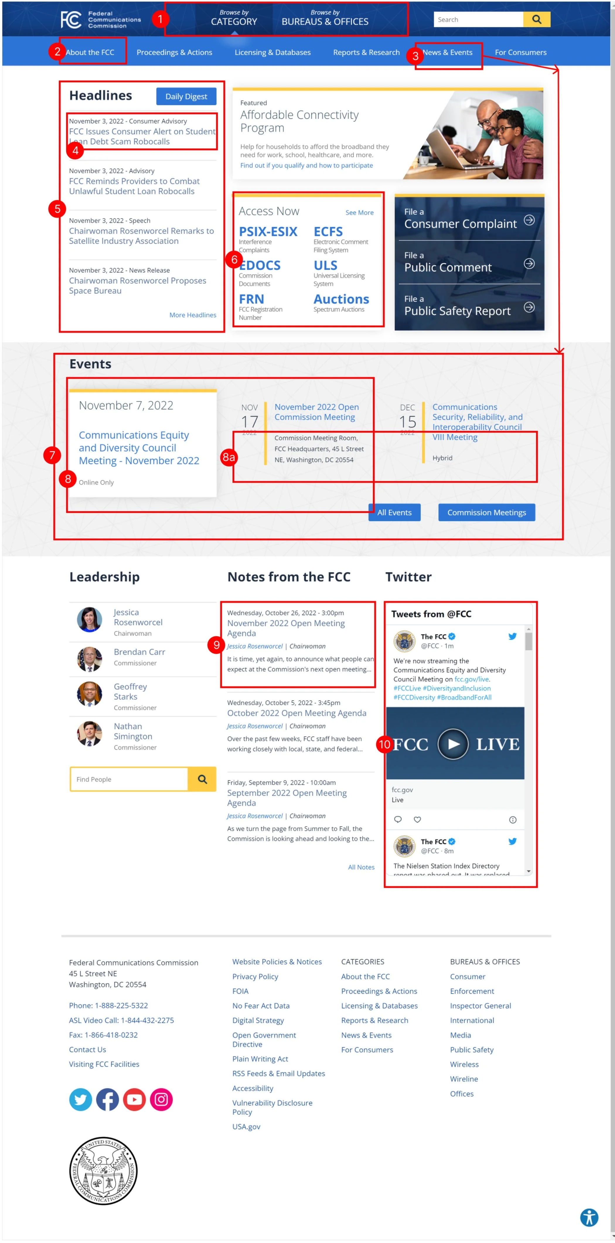
With the current site layout, consumers and users have to maneuver through the site with no clear direction of where or how they are getting to where they need to be. The initialisms and acronyms across the site leave little assistance to the user as to what they actually lead to. Some links are repeated multiple times on the same page, even the same section. The site is also needlessly crowded with text and tables that don’t read cohesively. Overall, it’s a confusing and chaotic information dump with no obvious organizational structure.
How to
Reinvent
the FCC :
Being tasked with redesigning a government site is no easy feat. While reconsidering the overall structure and display, we need to make sure that content and message are accessible and clear to every user, and that nothing is omitted for the sake of visuals. And what better way to revitalize the site than to take inspiration from one of their main areas of responsibility - the radio sector. The end result will be a site that is both functionally sound and universally user friendly.
Original
Concept

User Tests using Current Site:
We had users attempt a series of tasks that were all accessible from the FCC’s website - fcc.gov
Users were provided with both written and oral instructions for each task. Each task was designed to gauge how well users could navigate the current site. All tasks were intended to be easily accomplished.
The layout and organization of the current FCC’s site is formatted in a way that is overwhelming and confusing for the average user. The current site’s state caused our testing to result in a 45.25% average failure rate - oof! full test/source
User Tests
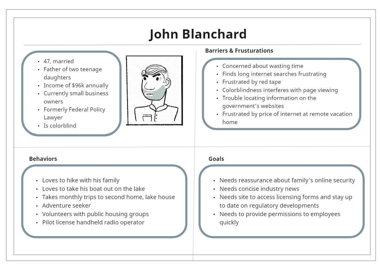
Meet John:
Our Proto Persona
Assessing Navigation:
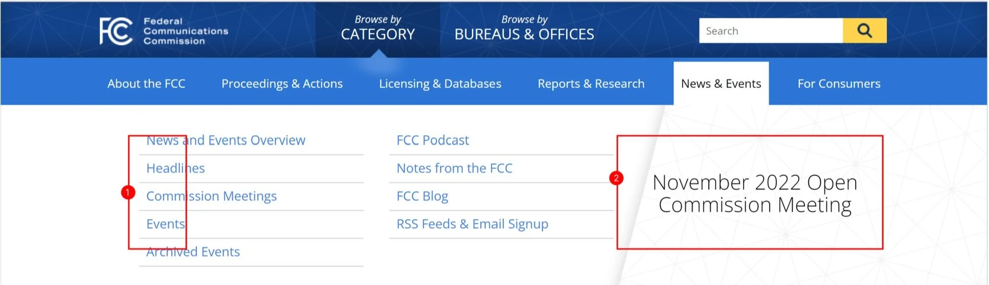
The current FCC header navigation bar attempts to create access to all parts of the site for consumers and users - but unfortunately, it’s an incredible amount of piled-up information in a condensed space.
Under the “Licensing & Database” tab, they sorted too much information in a confined space. While they did alphabetized the information - they did not include a key or description to these links. How is the average user supposed to navigate here?
*navigation annotations


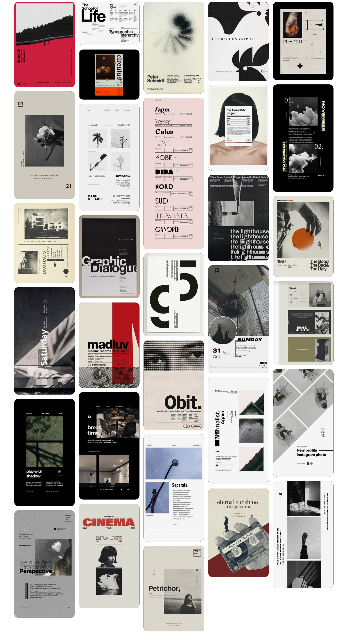
Mood Board & Inspiration:
The redesign will depend heavily on grids and text hierarchy.
The functionality of the site will focus heavily on:
Intuitive Design
Clean and Direct Pages
Inviting Displays
Clear Descriptions
By ensuring focus on these design fundamentals, the redesign will encompass all current information without straining users visiting the site. This is my vision for what the FCC can be, and all without losing crucial content and function.


New Concept Sketches:
Below are a few iterations for The FCC’s new concept. While different in design, each of these concepts focuses on a clean landing page which allows users to navigate to what they are looking for without being overwhelmed.
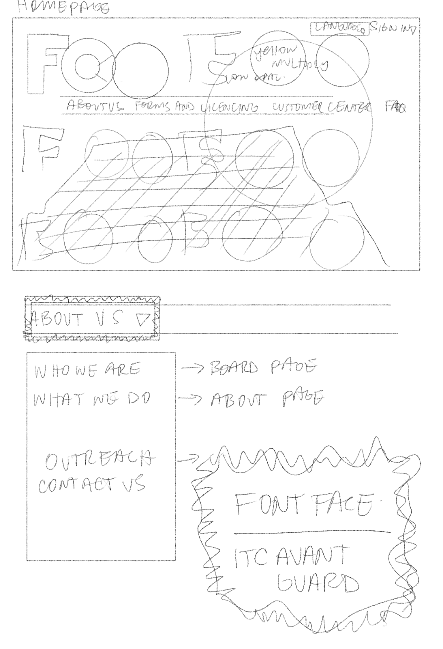

(even able to sneak in some real life
inspiration - The FCC’s home office)
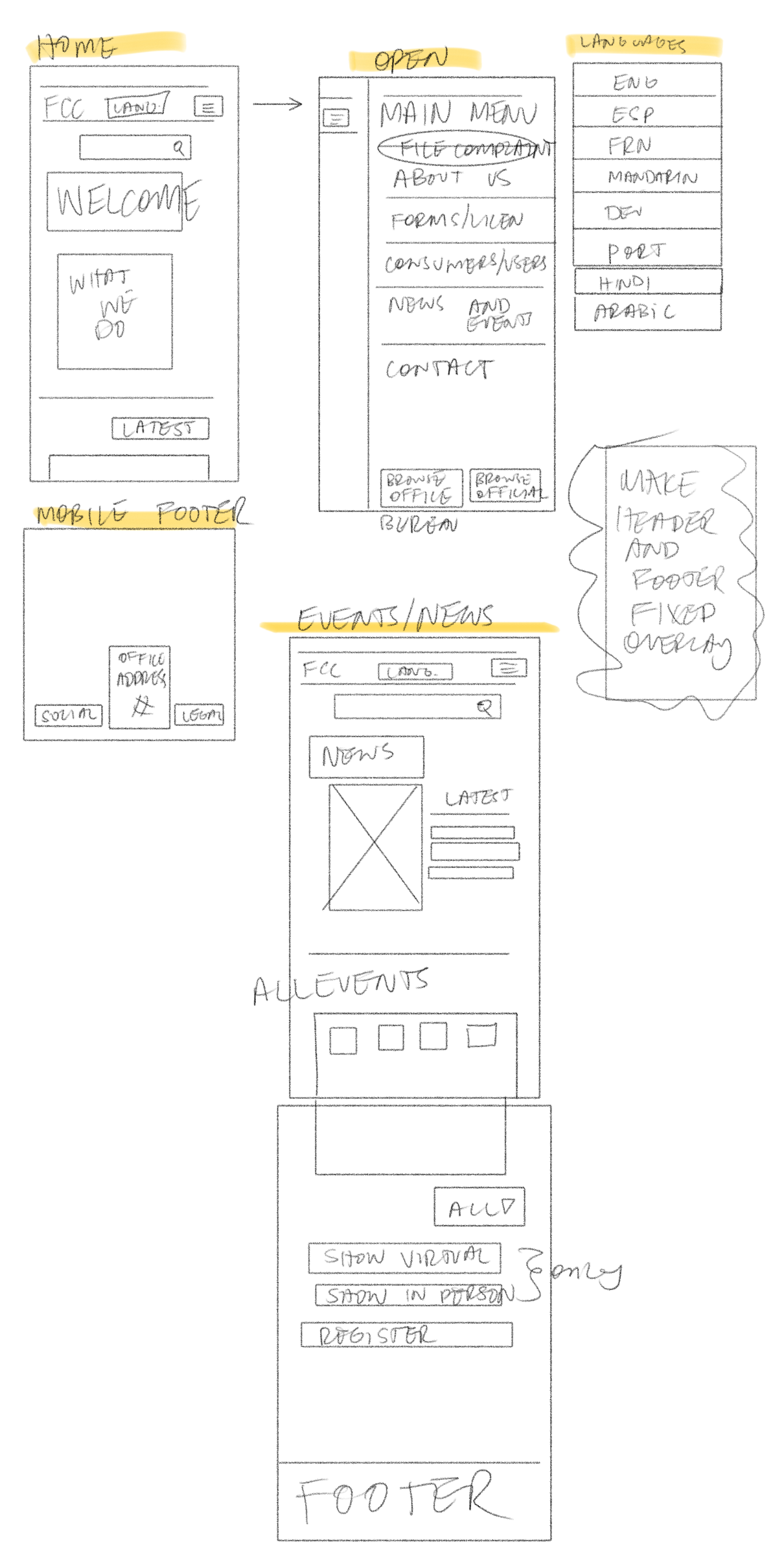
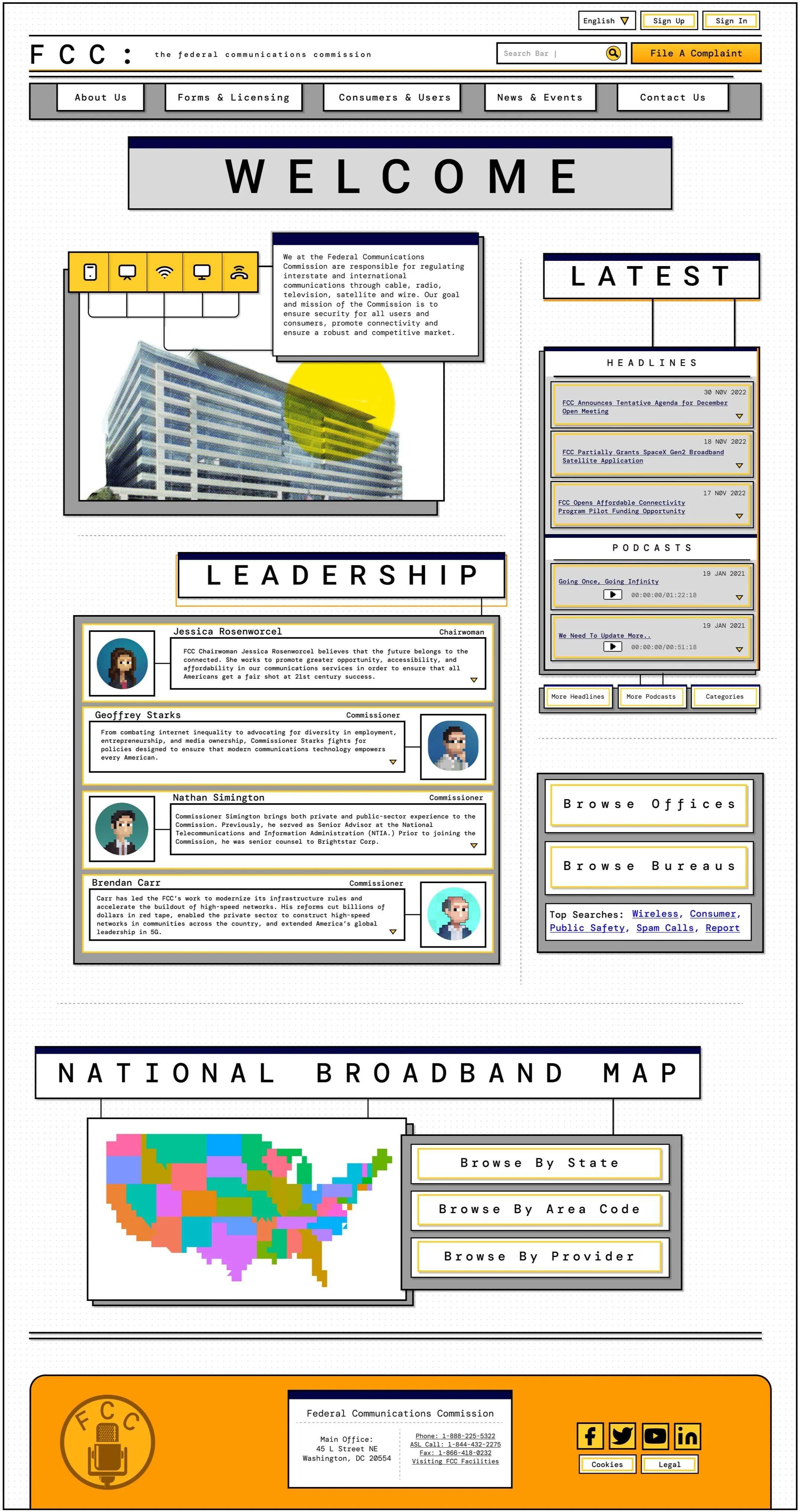
LoFi Prototyping:
Beginning the build out, we have the newly iterated concept for the rebuild. By eliminating all of the text bulking and repetitive information from the original, we have a successful first step. It begins with a clean landing page and intuitive navigation.
The navigation also receives a much needed reformatting and reorganization.

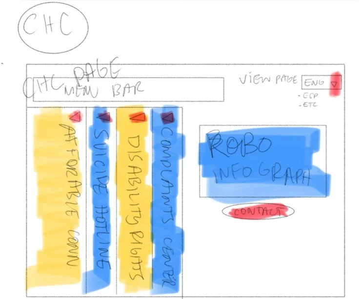
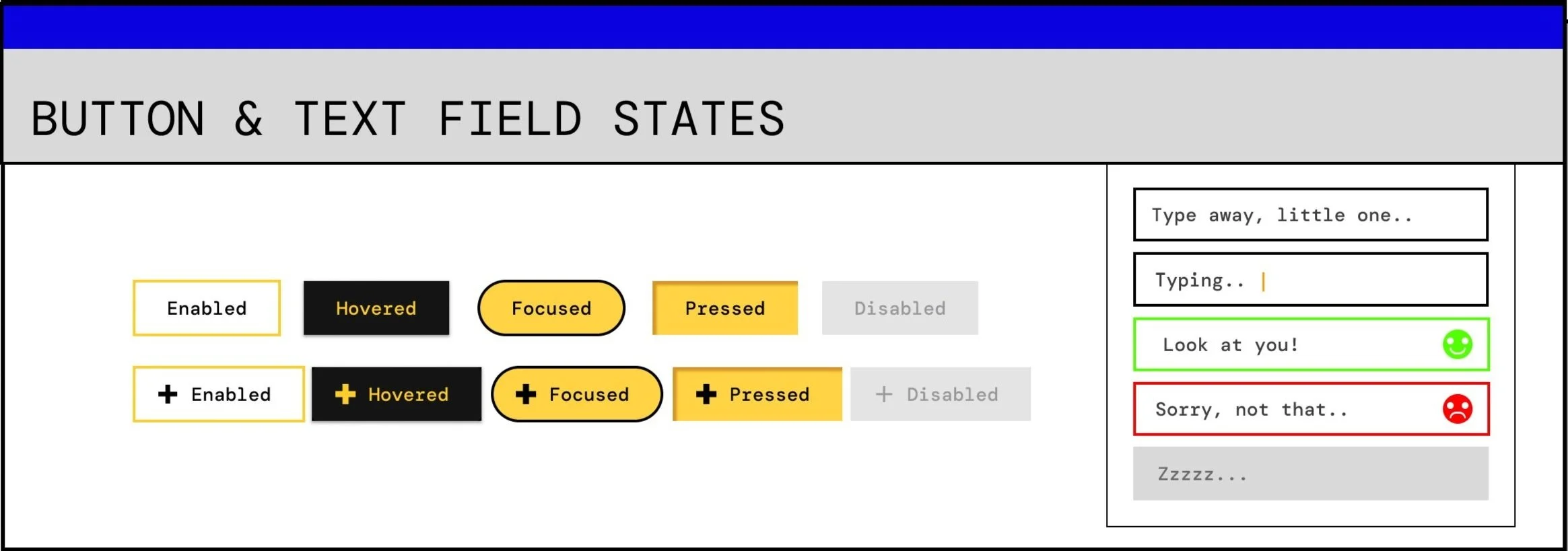
Prototype Testing with Style Elements:
An accessible, clean, straightforward, intuitive design. By grouping like categories and rearranging pre existing links, the new iteration appears more condensed but doesn’t sacrifice content. A simple color palette and consistent interface ensure a seamless experience.


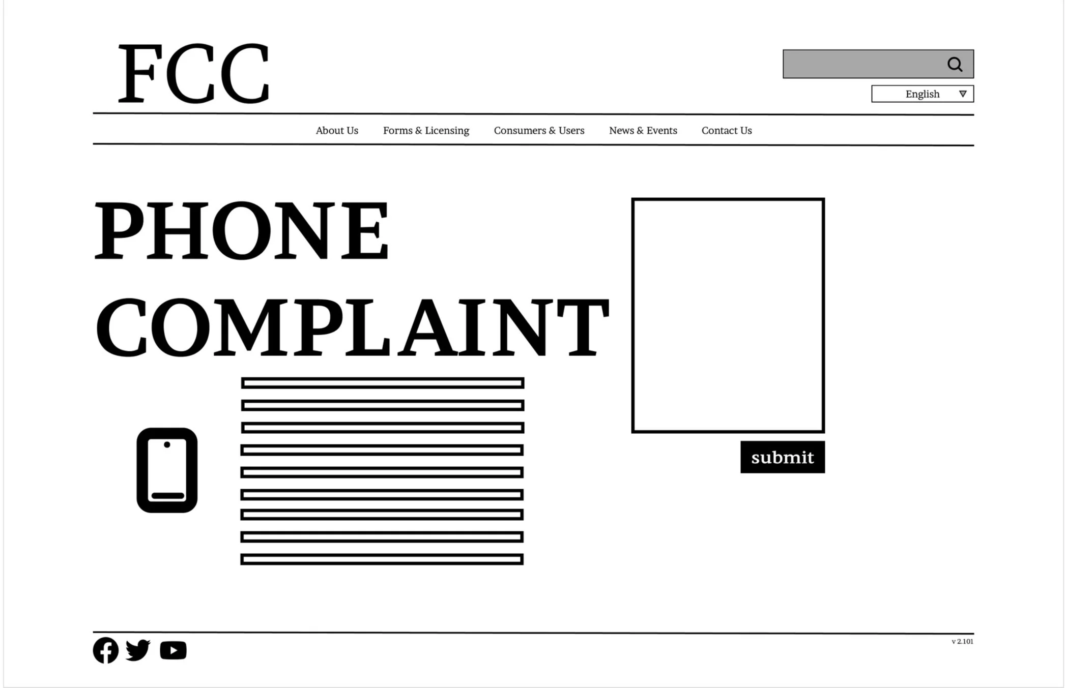
Hi-Fidelity Prototypes:
Here we are! After user & A/B testing, reiterating a multitude of times, and lining everything up just right, the design holds firm. Navigation is clean and simple and the layout is intuitive. (There’s also a little throw back just for some fun)


Future Features & Final Thoughts:
With more time, I would love to be able to develop a chat feature for users. No matter the need or inquiry. The FCC has so much potential in increasing user traffic - A simple PSA about citizen protections for example. A campaign against “Spam Calls” has the capability to be executed so well. Users can access a feature already available on the site (although it could use a little updating as well).
Now, while this design concept has very little potential to be adopted by the actual FCC, I am proud to call it mine. Here’s hoping for that “one day”!
Final Thoughts:
When first assigned this project, I was not sure if I would be able to find a direction and maintain inspiration during its entirety - all while also learning new skills and practices along the way. This project really tested my focus and commitment - but in the end, I honed my skills and put a passion project out there.
And of course, I can’t go without recognizing and commending my team on all their effort. Communication, commitment, and passion were all key factors.